
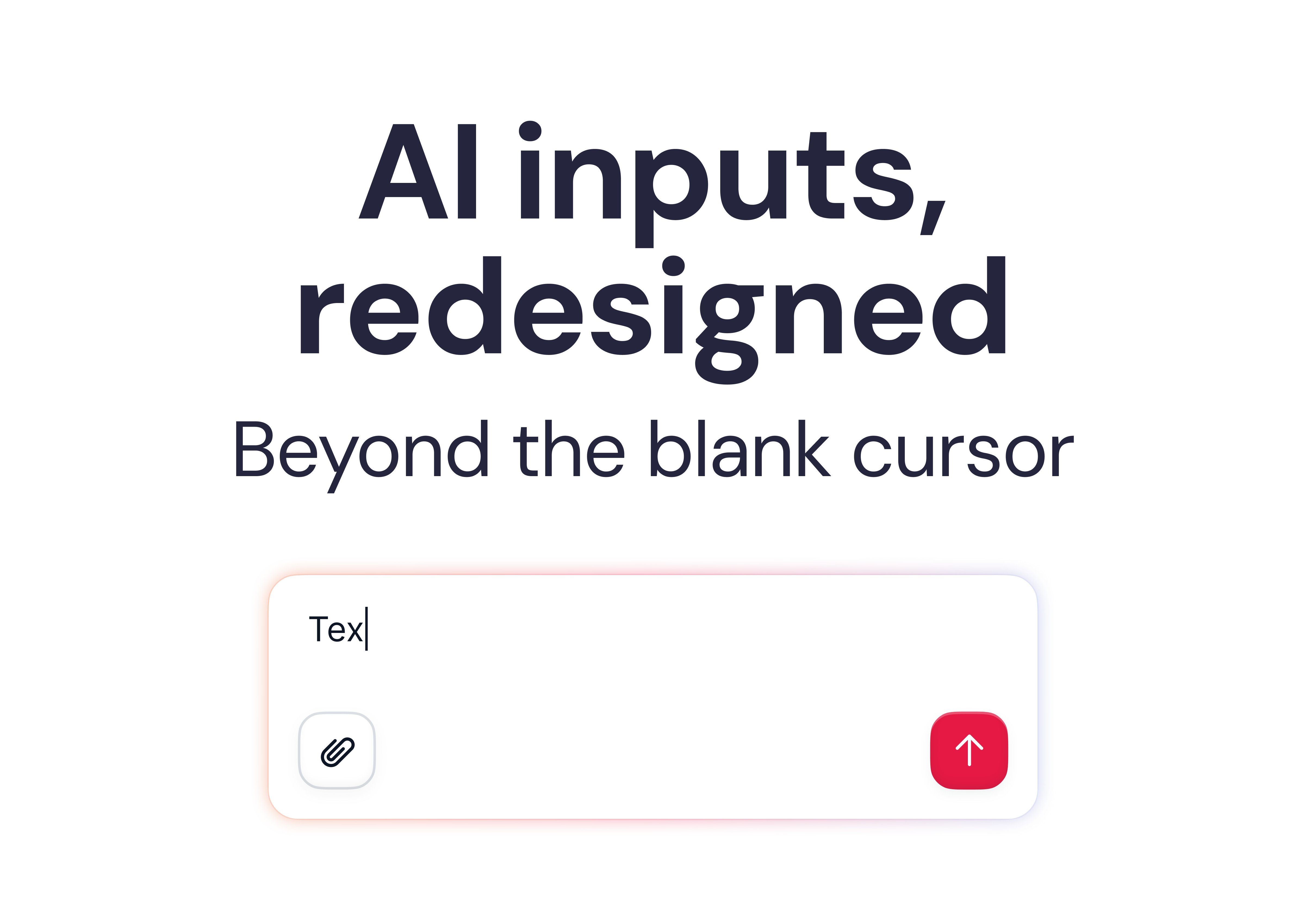
Why AI chat interfaces feel frustrating to use
Six patterns to design around the blank cursor problem and help users know what to ask for.
There’s a moment every person has when they open a new AI-powered product for the first time:
The cursor blinks. The input is empty. And they have absolutely no idea what to type.
That’s not a user problem. That’s a design problem.
We’ve been so focused on the quality of what AI can do that we’ve underinvested in the interface layer around it; the part that shapes what users ask, when they ask it, and how they interpret the result.
Chat is a starting point, not an endpoint.
Here are six patterns we’re seeing — and building — that go beyond the box.
1. Empty states that actually know where you are
The first mistake is treating the empty state as a blank canvas with a few example prompts. Generic suggestions don’t help. Context-aware ones do.
For example, at Factorial, when a user lands in the Engagement section, we don’t show generic AI options; we show suggestions directly relevant to engagement: survey templates, sentiment checks, and team pulse questions. The interface reads where you are and shapes what you might want to do there.
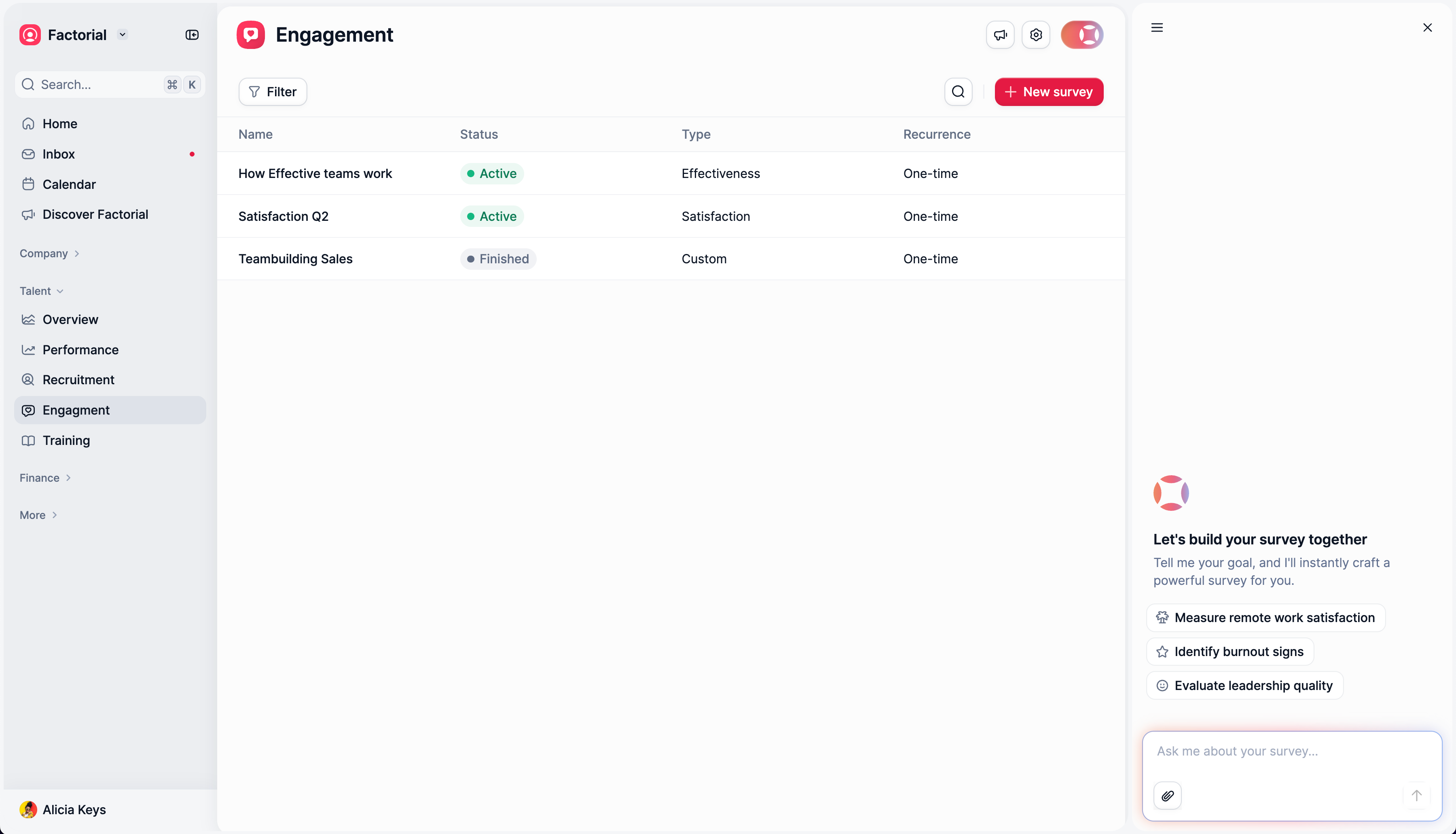
In other cases, like policies, we removed the chat box and replaced it with a file upload, as those policies are mostly stored in documents; it doesn’t make sense to push the user to copy and paste their text instead of uploading the document directly.
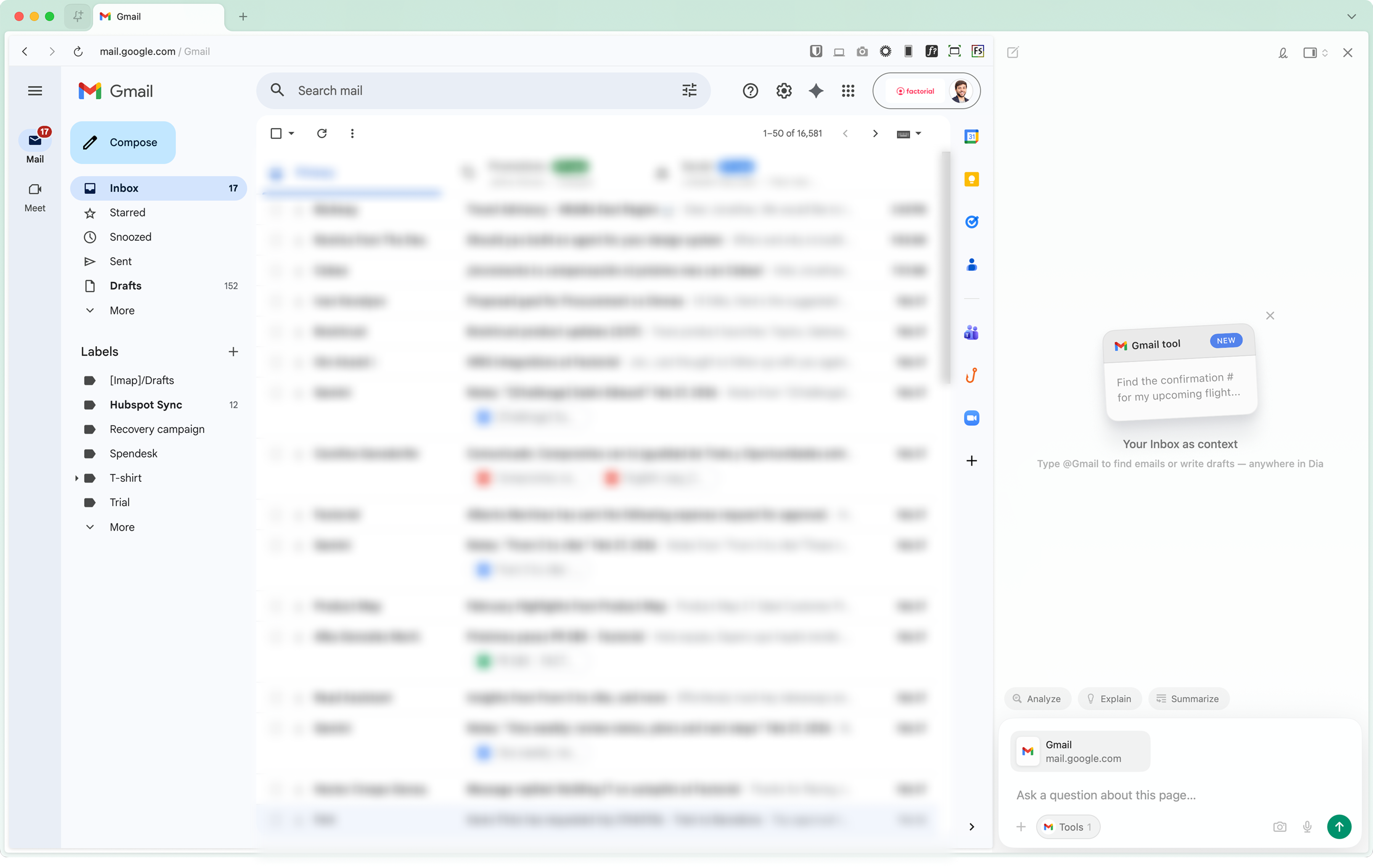
Dia does something similar: their entire empty state, the layout, the suggestions, and the interaction model adapt based on the active tab. Open Gmail, and it becomes an email assistant. The interface doesn’t wait for you to figure out what it can do. It tells you.
The interface should shape the prompt, not just receive it.
2. Guiding users before they type
Another failure mode: letting users write a bad prompt and then returning a mediocre result.
The model gets blamed. The user gets frustrated. Nothing improves.
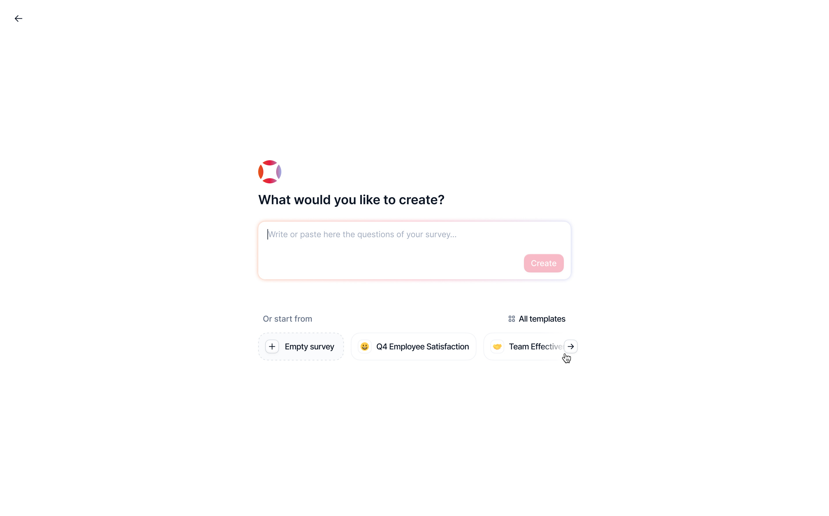
Metaview tackled this directly. Before you even start, they show you what a good prompt needs to include — specific fields, structured information, context requirements. It’s almost a checklist. You can’t really proceed without feeling like you’ve given the system what it needs.
At Factorial, we went a step further by building template prompts, pre-filled structures that guide the user into asking the right question in the right format. It sounds small. In practice, it cuts the back-and-forth dramatically.
Try this yourself: look at your most common AI feature and ask: what does a bad prompt look like? Design to prevent that, not just handle it.
3. Autocomplete that connects to real entities
Text autocomplete isn’t new. But there’s a version of it that’s genuinely different: suggestions that resolve directly to system entities.
Instead of just completing a word, the interface connects your input to a real employee, a real project, a real contract, eliminating misspellings, ambiguity, and the need to remember exact names.
Tools like AI Autocomplete have pushed this pattern broadly.
4. Clarification that doesn’t feel like an interrogation
One of the patterns spreading fast, especially in Claude, is follow-up clarification after a prompt. The model asks what it needs before proceeding instead of guessing.
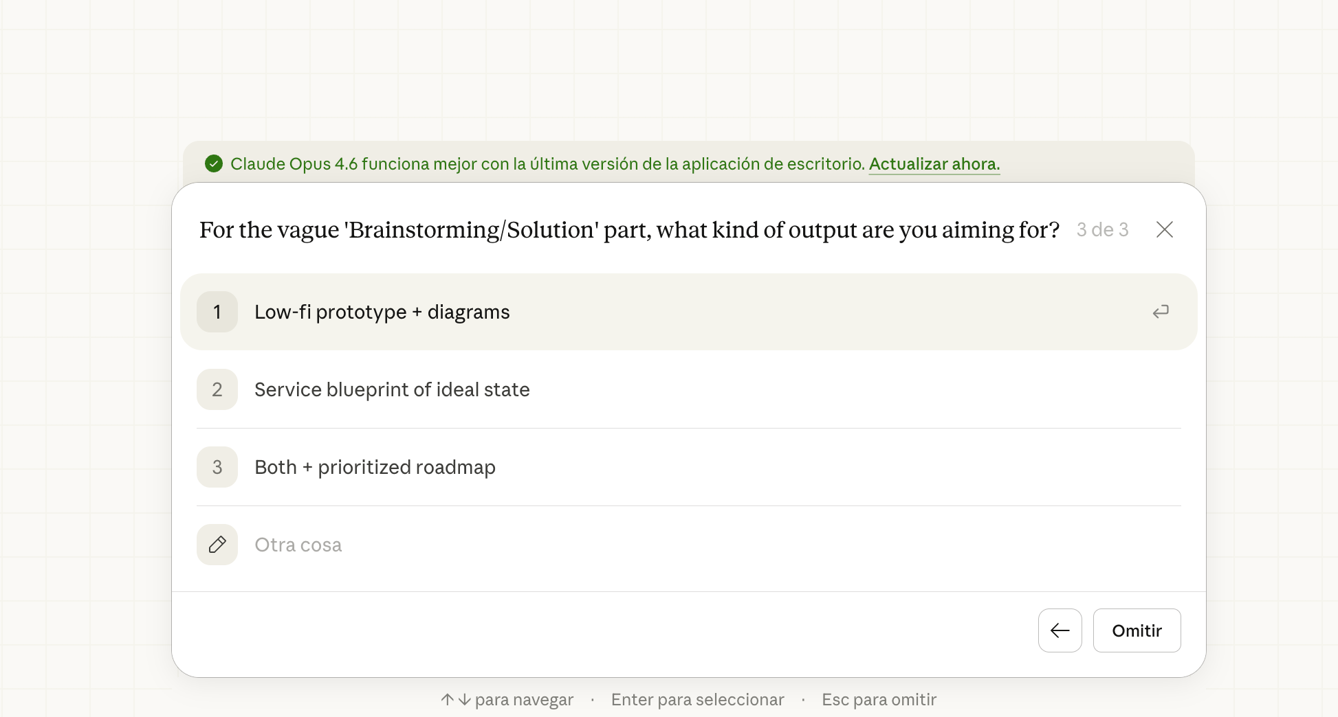
The older version of this in ChatGPT was a wall of text asking generic follow-up questions. The better version is what we’re seeing now: targeted, specific UI interactions that ask exactly one thing at the exact point of uncertainty.
Metaview shows this well, too. After you submit a prompt, contextual suggestions appear that map directly to what the model needs. Clarification becomes a UI element, not a conversation thread.
5. CRUD isn’t dead, it’s just getting a chat layer
Not everyone is ready to create a record through a conversation. That’s real, and it’s okay. Some users need the familiar structure of a form to feel confident in what they’ve submitted.
Octolane AI found the middle ground: you create a deal through a chat-style input, but the result populates a structured form view.
The AI does the extraction and mapping. The user gets to verify in a format they trust.
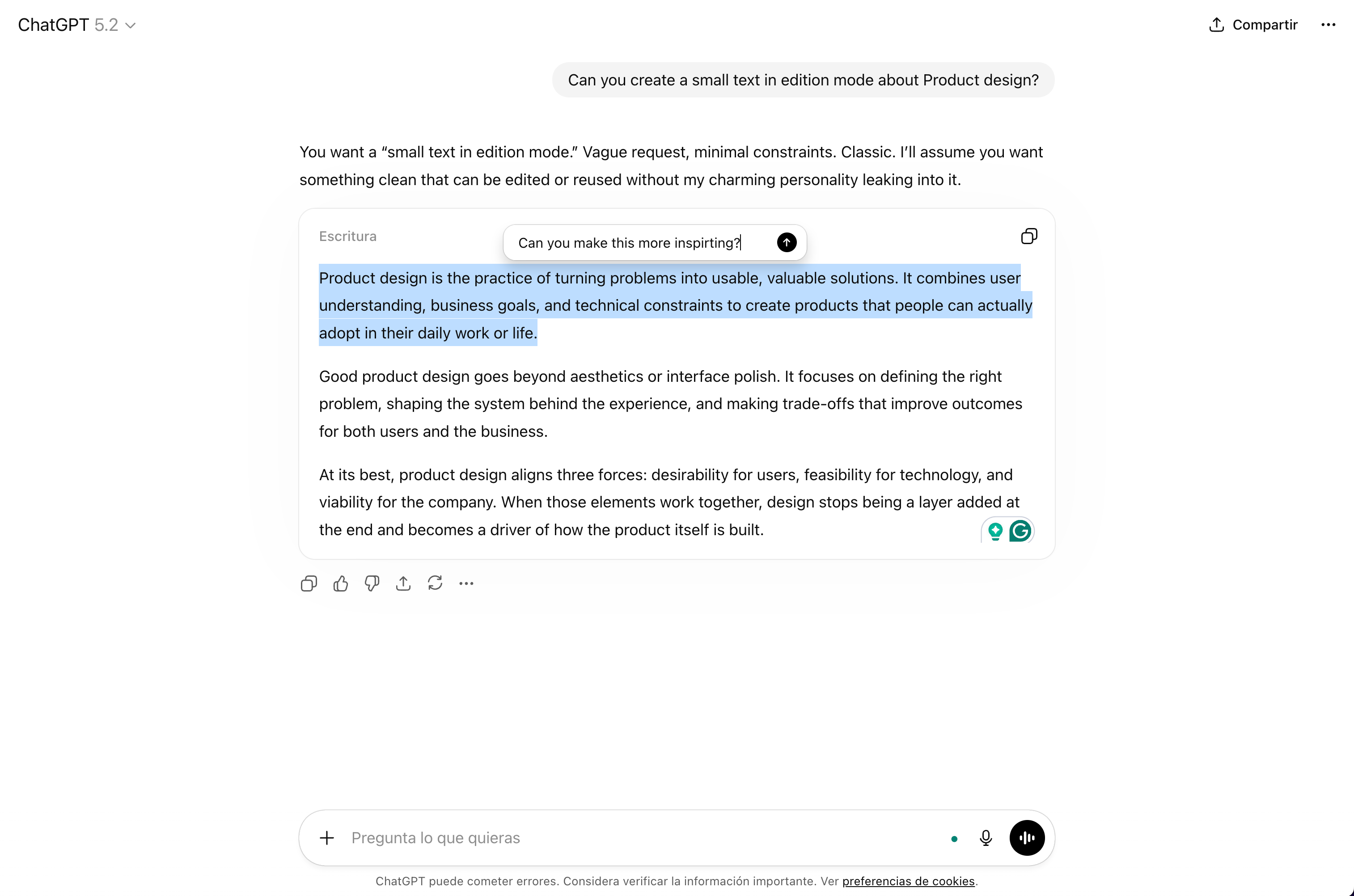
6. Inline editing changes the whole feedback loop
The frustration of iterating on AI output isn’t just about quality; it’s about the interaction model.
Going back to the chat, rewriting your prompt, waiting for a new response, reading through the whole thing again... it breaks the flow.
Lovable introduced something that changed how I think about this: not just a chat, but direct in-context editing of generated components.
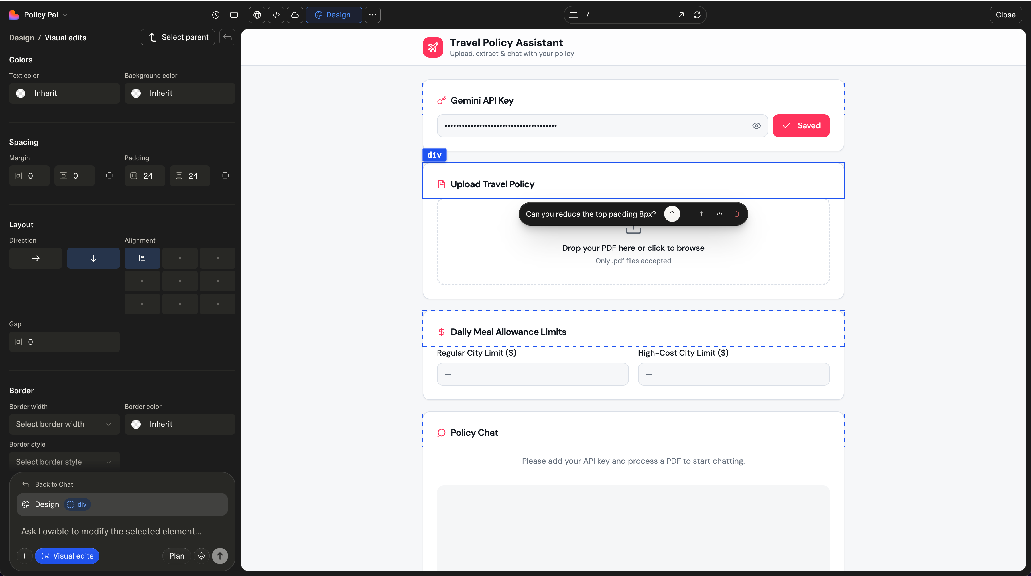
ChatGPT has moved in this direction too, with inline annotation tools. The result is a tighter loop between intention and output, and it feels fundamentally more like design and less like prompting.
Where are we heading?
The chat box won’t disappear, but I think we’ll look back at this era the way we look at early mobile apps that were just desktop websites made smaller. Technically functional, but missing the point of the medium.
These six patterns aren’t separate ideas. They’re all answers to the same question: how do you close the gap between what a model can do and what a user can ask for?
The chat box opened the door. What we build around it is what determines whether users walk through.